Monday 20 April 2015
Saturday 28 March 2015
Evaluation - Theory that applies to my Coursework
I created a PowToon presentation in order to illustrate all of the different theories that applied in particular to my music video and ancillary texts. I named the theorists, explained the theory and then explained how I used this specific theory in my coursework or how it applied to my coursework.
Friday 27 March 2015
1) In what ways does your media product use, develop or challenge forms and conventions of real media products?
First of all I produced a Prezi, in order to present the main dominant ideas and to include the inspirations that I have been affected by during the course of the planning and research and production. The Prezi includes an outline of what I had used, developed or challenged. I also included links to my Youtube Video, my digipak and my magazine advertisement, therefore I could refer to the production of these whilst explaining my decisions.
In terms of the digipak, I looked on the Bastille Official
Website for a source of information. This is where I found the Brits Logos and
the couple of iTunes advertisements, therefore I thought these would be
appropriate to add on, as they were featuring on the website, therefore they
must be official and effective. The colour of them also fitted in with the
colour scheme, therefore they were effective to apply onto the digipak. I
placed them both fairly small, as they are not as important as the other
conventions, such as the song titles or the image on the back cover, as this
was the conventional thing to do.
Also, on Rihanna’s digipak, I liked the way she had an extreme
close up with her eyes closed. Therefore, I applied this to my disc covers, as
I think it looked effective. I feel like it created a bond between the audience
and the cast members and audience. The fact she has her eyes closed also
symbolises that an ending to something has arrived. Therefore, this links in
with my music video, as I was trying to emphasise that the ending to the bad
lifestyle has arrived. Also, to create continuity I applied the same side
borders all along the digipak, I also took the side borders from one of the
drafts from my magazine posters, and therefore it allows them all to fit
together. On all the side borders that I have researched, it appeared that the
band name and the single title were the main aspects, therefore I made them quite
significant and large. Also, I followed the conventions of putting these pieces
of information on the side, as for example, when the digipak is stacked in the
shop, the artist and song title is clearly visible, as there is more chance
that the audience will recognise it, and be more likely to purchase it.
Also, the cocktail glasses and the clock were significant
parts of the music video, therefore I decided to add them onto the digipak, and
this way the audience can easily recognise these aspects from the video and
link them together. For example, within the script digipak, the hands of the
people involved were included and well as guitars, therefore I followed this
example of using existing conventions of digipak and used abstracts ideas. I
put these on the inside covers, as I did not think they were as important as
the other conventions, such as the photographs of the cast member on the front
cover for example. In terms of conventions, on digipaks the location is usually
used, for example as in the Katy Perry digipak. Therefore, I included a
photograph of the nightclub, as this was the location of the music video,
therefore the audience can immediately form a bond between the music video and
the accompanying ancillary texts.
I changed conventions when I was applying the effects to the
photographs as I rarely see this aspect used in digipaks, therefore it was
something different. When I was experimenting with different colouring and
lighting on Photoshop, I was able to look at different edits. I liked the look
of them, as I felt they looked effective, therefore I confidently applied them.
This was not based on existing conventions as I had not seen this previously,
therefore I had no inspiration to base it upon.
Also I had never seen the tripling of a photograph on the
front cover when I was researching digipaks during the planning and research
stages. It was once again based upon me experimenting with effects upon lots of
different drafts. When I decided upon duplicating the photograph three times, I
also experiment with adding different brightness and contrast to each
photograph, therefore I applied this and I felt it also fitted in with the rest
of the digipak and looked effective. The photograph also fits in with my
narrative as I desired, as it begins light and turns dark, suggesting there has
been some form of major change throughout the narrative.
In terms of the Music Video Magazine advertisement, I changed
conventions quite a lot. As I made the conscious decision to use the same cast
member throughout, I was attempting to create ideas that included both of these
different personas within one poster. Therefore, I decided I would merge their
faces together. This way the narrative would also fit together, as the two
people meet within the video, as their lives change. I also made changes to the
typical conventions that I had seen, for example within the Ellie Goulding
music poster, she has the same colour scheme and it is consistent throughout.
In terms of my poster, I didn’t use this technique, as I was merging two
different lifestyles together, I thought it would be appropriate to merge two
different colour schemes together too, to provide the audience with some
element of continuity.
In terms of following conventions, I had the social media
aspects included at the bottom of the page, as I have seen regularly when I
have been researching music magazine advertisements, therefore I decided it
would be sensible to apply the social media logos at the bottom of the page
with the name of the artist and how they appear on these networking sites, this
was a postmodern element and therefore it is very stereotypical to use this, as
the audience would initially already expect these conventions when they see a
music magazine advertisement. Also, I included another convention, as I
included a review from a well-established newspaper, this way the audience will
become larger as a popular newspaper has spoken of the song in a high and
appreciative way. This is a good convention to include, as again the audience
will expect to see this convention, as two media forms are merging together and
improving business for one another. Another unconventional aspect of the
magazine advertisement was that I expressed two different emotions on one page,
which was something I had not seen before, as on the left side the face is
upset and on the right side, more emotions of happiness are expressed,
therefore it directly expresses two different forms of emotions. This would
also contribute to the idea of ambiguity that I wanted to develop further.
I also followed conventions, as for example, within the Lana
Del Rey music magazine advertisement and the majority of the other magazine
advertisements that I have seen, had a close up of the most important person
within the video, sometimes it is the cast member and sometimes it is the
actual artist. Although, I thought this camera framing was extremely effective
for the size and measurements of the poster that I was dealing with and also
the outcome that I wanted to achieve of merging the two faces together,
therefore I used this aspect. It allowed me to split the page into two and also
allowed me to highlight the cast member as the convention with highest level of
importance on the magazine advertisement. Therefore, the audience will be able
to establish that she is the most memorable and important within the music
video, they are also more likely to remember the face, as I used techniques
such as direct address in terms of the cast members eye contact. I also
followed conventions, as when I was looking at music magazine advertisement
that other students had made and also existing music magazine advertisements, I
could see that applying a band across the bottom of the screen was very
conventional. But, it made the advertisement look neat and presentable, this
was also really good as it allowed me to put the text and information somewhere
and therefore it did not contrast directly onto the photographs that I was
using. I experimented with colouring and size with the band across the bottom
and after many drafts I finally decided on a design which I liked and thought
was appropriate to work in conjunction with the music video and the digipak.
In terms of the video, my idea stemmed from Ed Sheeran’s –
Give me Love video, where there was a poor girl and she had to find her way to
happiness somehow. My orginal idea was to have a poor girl who needed help and
then a boy came and rescued her, I pursued this idea continuously for a long
time, but I did not feel like it was interesting nor did it really fit what I
wanted to achieve in the end. It was also very conventional and had been done
many times before. Therefore, when I began filming I came up with the idea of
the contrast between a poor girl and rich girl, but the girl being the same
person. I wanted to convey the message that things can get better and life can
be massively improved. Therefore, this is how my ending idea was established
and developed further.
A major problem with my music video was lighting, as I
filmed some parts in the day and night and it was difficult to make them work
together, this was not very conventional as I have never seen this before, as
it did not look very effective. I used a range of camera shots throughout the
music, for example at the beginning of the music video when the feeling of the
video was sad, I used a lot of long, slow shots to reflect her mood, to support
this I also used close ups of her face to represent sadness and shots of her
full body to show the dirty and lack of respect she had for herself. This was illustrated
with the mise-en-scene of her living outside and having ripped and muddy
clothing. Whereas, in the second half of the video I used a wide range of fast
and short shots to show the rich party lifestyle that had been established. To
develop these conventions, I also used a dramatic change in colour scheme, as
the beginning was dull and dark and the ending was bright and colourful, as I
thought this illustrated the contrasting themes really well and supported my
ideas.
I did not follow conventions particularly with the music
video, as my aim was surround the video around love between a man and woman.
But instead I focused on the girls love for herself and how her life could be
dramatically changed if she realised this. I also did not follow conventions,
as I changed them, as I used words within the music video to help illustrate
what was occurring, for example when the person met the opposing side of
herself, I had the words “Let’s Unite” come up on the screen. I had never seen
this effect used within the genre of Alternative Rock, I had only seen it used
by the artist David Guetta in songs such as Bad, within the genre of Pop.
Therefore, I attempted to change this convention and use it within a different
genre. I enjoyed experimenting with different words as I felt like it
illustrated the images nicely and was a strange and peculiar aspect to include,
that would stimulate thought within the audience.
Also, the ending of the music video is much more dominant
and significant than the beginning of the video. The beginning focuses on the
stereotypical “damsel in distress” therefore, this is a very conventional
aspect and she turns rich and successful, and there is also a stereotypical
“happy ending”, therefore conventions of a narrative could be found in these
aspects. My narrative differed from this as in terms of timing I focused
predominantly on the happy aspects as not many music videos merge happiness and
sadness together in such a drastic and dramatic way. Although, I did changed
conventions slightly, as stereotypically in music videos with a narrative that
involve a “damsel in distress” followed by a “happy ending” usually include two
people, therefore I have differed slightly by deciding to have my cast member
playing the antagonist and the protagonist but with two different personas.
2) How effective is the combination of your main product and ancillary texts?
I produced a SlideShare presententation to show some examples of the changes that I made to sure that the combination of the main product and ancillary texts worked effectively together.
Positive aspects of the combination of the music video, digipak and magazine advertisement.
I think the colour schemes from all aspects of the coursework work together effectively, as some element of continuity has been presented throughout. I used bright colours in contrast with dark colours throughout the coursework, as this worked in relatioin to the narrative of the music video. I wanted to reflect the main idea of the music video onto the ancillary texts well. I think it is easily recognisable that they work in conjunction with one another, due to the use of logos, photographs and locations. The cast member who featured within the music video, was also present during the production of the ancillary texts. I believe this is a positive aspect because it shows the cast member continously throughout these aspects. I think another positive aspect in terms of how well the music video works with the ancillary texts is the use of text, I continued to use the same typography therefore they were all able to link together, sometimes I varied the colour of the logos, therefore I was able to fit it in, to merge with the particular images I was using. Throughout the filming and throughout the production of both of the ancilarry texts I continued to use close up shots or extreme close up shots, as I felt that it was important that the characters facial expressions and emotions were cpatured, as they were relevant to the story line. Thefore, this added to the continuity that I had established, as the shots are all different but using similar camera angles and framing.
Also, another positive of my ancillary texts was that I included links to social network sites, therefore this is providing modern features and it looks proffessional when adding conventions that usually appear on such products. This also added continuity between the two ancillary texts as I advertised iTunes, Facebook, Youtube and Instagram between the two, therefore both of them held these particular features. To accompany this I added recognisable logos on both the digipak and magazine advertisment, I also included different logos that were not social networks such as the Brit Awards logo, therefore this is conventional to promote and support the band and the single itself.
Within the music video and ancillary texts, I would able to link them all together effectively, as I used images from the music and applied them onto the digipak and ancillary texts, therefore the audience will be easily able to recognise them if they have watched the video. Also, I wanted to achieve the outcome of the digipak and magazine advertisment being reflective of the narrative in some way, therefore this is why I used images of the glasses, nightclub and clock, as these were significant aspects of the music video that are easily recognisable and stand out. Within the magazine advertisement, I think the photograpsh stood as an effetive reflection of what happens in the music video, as my aim was for it to reflect the contrast and change as this occurred within the music video. Therefore, to conclude this idea, I made it my aim to ensure that the narrative of all aspects of production was reflected and linked throughout. This is also conventional, as usually within the media when an artist and company produces a music video, digipaks and magazine advertismenets they all link together in some way as this leads to their success.
Negative aspects of the combination of the music video, digipak and magazine advertisement.
I feel like the quality of some of the photographs varied on the digipak in comparison to the magazine advertisement, therefore they did not look as effective as one another. This was as a result of the edits and changes that I made to the photographs using Photoshop, and changing the brightness and contrast. Therefore, after I had made these changes the quality and size of the photographs looked different between the two different ancillary texts. As I have never created a music video previously and had limited knowledge and experience with using any editing programme such as Final Cut Pro. I was able to develop some skills, although I felt these skills were quite basic and I feel like I could have developed them further in order to improve the quality and present of the music video, as I feel like it provided elements of confusion. I also applied the same edits to the magazine advertisement, as I had with the digipak, but I did not like the outcome when I had finished editing the photographs and text on the magazine advertisement, as I felt like it lessened the quality and effectiveness of the ancillary text. As with the photograph I have added to the left as evidence, when I experiemented and applied the same edits as I have with the digipak, the physical appearance did not look good. Although, I wanted to achieve continuity throughout the ancillary texts and music video, I felt like applying the edits made the images look less effective and it was more difficult to establish the two different personas of the girl, and therefore it was difficult to link it back to the narrative. Therefore, this was a negative aspect as I found it hard to achieve complete continuity within this aspect of production. I stuck with the simple edits and features and although these were less difficult, I feel like the end product looked much more presentable and neat. As I felt over editing and changing the photographs too much only resulted in negative outcomes. Also, another aspect that was not continout was the tripling in the photograph on the front cover of the digipak, as I did not apply this effective on the music video or the magazine advertisment as I felt that I was trying to achieve different imagery within these.
Possible improvements
I thought that using the same cast member throughout the production of the music video and ancillary texts was effective as it provided strong elements of continuity. I was able to vary the looks and style of the girl, therefore it looked effective as there was lots of contrast. I think I could have possibly experimented with different cast members, as there could have been positive results. As previously within my storyboard, a male cast member was involved, therefore I think it may have been more beneficial if I experimented with different shots and scenes with a male cast member, just to see what effect it would have on the video and ancillary texts. I think including a male cast member could have developed the narrative further, despite this, the narrative would have been unorignial. Also, within the digipak and magazine advertisement I focused predominantly on the richer girl rather than the poorer girl, therefore I feel like I should have devleoped and used the photographs equally. I also changed location during the beginning of filming, therefore the visual elements will have improved dramatically, and continuity would have been provided if I organised to use the same location at a similar time.
I think that the ancillary texts could have been improved if I developed the planning and research aspects further, as then I would have further knowledge on how the different existing layouts are presented and could base my designs on them. I drafted the ancillary texts and the music video several times, therefore this gave me time to have the opportunity to link them all together. I drafted them by hand and digitally, therefore I was able to experiment with lots of different images and text to see which lay out was best. This method was extremely beneficial in terms of planning and research and also reaching the outcome that I wanted. I ensured that I thought about all of the aspects of the music video and digipak and ancillary text such as colour schemes, layouts and measurements and dimensions. As I edited using Final Cut Pro and Photoshop, it gave me the opportunity to develop my existing skills and learn new ones, as I was able to edit moving images and still images to the best of my ability. Photoshop allowed to add the appropriate dimensions and measurements, as well as use similar edits during the production of the digipak and magazine advertisments, therefore there was continuity throughout. Also, within the music video, Final Cut Pro allowed me to differ the brightness and contrast and also apply colour edits, therefore visually they looked similar to the digipak and ancillary text.
I completed analysis's focusing on language, ideology, institution, audience and representation. I explained my decisions, expanded on the reasons behind them and expressed my views on particular aspects. I also added influences and analysing my own work.
3) What have you learned from your audience feedback?
I conducted an interview with Millie, were I asked her numerous questions about my music video, digipak and magazine advertisement. She answered with her view and opinions and suggested any possible improvements. I recorded her answers, therefore I had the ability to upload the video onto Youtube and my blog.
I wrote some questions and conducted questionnaires with people who did not study Media, therefore they gave their outside perspective and views of the main product and ancillary texts. I interviewed people who were of different genders and age, therefore I could get some different responses, as if they were within the same age range and gender, their views might be similar.

From this I learnt what the most effective parts of the music video was, therefore I could watch these particular parts which were mentioned and focus on how I completed these shots and possibly what effects and edits I had applied. I took the opinions on board and focused of what particular aspects of the music video they were mentioning, most were based upon the mise-en-scene or particular camera shots and movements, therefore this highlights that these were my positive features.

From this question I was able to see what the negative parts of my music video was, and points which were on the basis for improvement. Most of the views and opinions were based around the speed of the shots and the number of shots at particular times, therefore from my audience feedback I could learn that at particular times within the video I need to focus predominantly on what is happening and the speed at which I want it to happen, as then I can fit the timing and shots with the song proportionately, so it all fits together smoothly.

The views based upon my magazine advertisement were really positive, and therefore there was not much criticism to focus on. This feedback was predominantly negative which showed that this particular ancillary text has a positive result on all members of the people I was interviewing, therefore it is likely that an audience as whole would think that it was effective.

The feedback for the digipak was also really effective and positive. The audience feedback as whole showed that my ancillary texts appear to be stronger and of a higher quality. As the people who were answering the questionnaire all used positive vocabulary I can assume that it looked effective as they also mentioned that they could imagine seeing the digipak in a shop.

The contrast in colours was one of my main aims within the production aspects. Therefore, when I focused on this aspect I attempted to complete it to a high standard. Also, there is also a mention that the colours were a bit dark at some particular points and therefore this could be an important point in terms of analyzing my audience feedback. From this I have learnt to edit the photographs so that no elements of the photo are too dark, as it complicates the ancillary text and lessens the quality of the product if it is not visually effective.

This was a question which held a high level importance in terms of audience feedback, as the improvements are things that I need to take into consideration. As a whole, they surrounded around the darkness of the shots and colours and the amount of shots that were taken within particular time periods, therefore I have learned that these are the areas that need improvement, as they were not as effective as the rest of the music video and ancillary texts. Also, there was a mention of mise-en-scene and using lots of different costumes, as within the music video and ancillary texts I only used two different costumes to provide a contrast between the two different people. I have learnt that this could be a possible aspect to consider, although personally I feel like adding more costumes may complicate the narrative and stimulate confusion within the audience.


From this particular question I learned that all of my photographs worked in conjunction with each other well, therefore the continuity and the effectiveness of the main product and the ancillary texts was successful. I learned that applied edits to the photographs was also a really effective way of making the photographs look different and more effective, as the photographs before they were edited were quite dull and boring and did not really spark any interest. I also learnt that taking photographs from different angles and frames was also effective as it added something different, instead of the same shots just being used continuously throughout.


4) How did you use media technologies in the construction and research, planning and evaluation stages?
I highlighted all of these elements of technology and the processes that I had used. I included print screens and appropriate image to accompany the descriptions and explanations. I split it into planning and research elements of technology, and how I used technology throughout the production element of technology. Before completing this element of this evaluation, I listed all of the technologies that I used, therefore I could refer back to this throughout the completion of this question.

I used Powtoon to add variety to my planning and research. As I was stuck in a cycle and found myself continously referring to SlideShare, therefore the presentational aspects were all similar and began to get boring. Therefore, I used PowToon, this way I got the opportunity to learn something different and explore a different website. I also got to see different movements and layouts when creating a presentation that were something I had never seen before. Therefore, this allowed me to expand my knowledge of presentation website and also allowed me to learn new skills. I also used the technique of embedding within this, as I also merged BlogSpot and Powtoon together when applying the presentation onto my blog successfully.


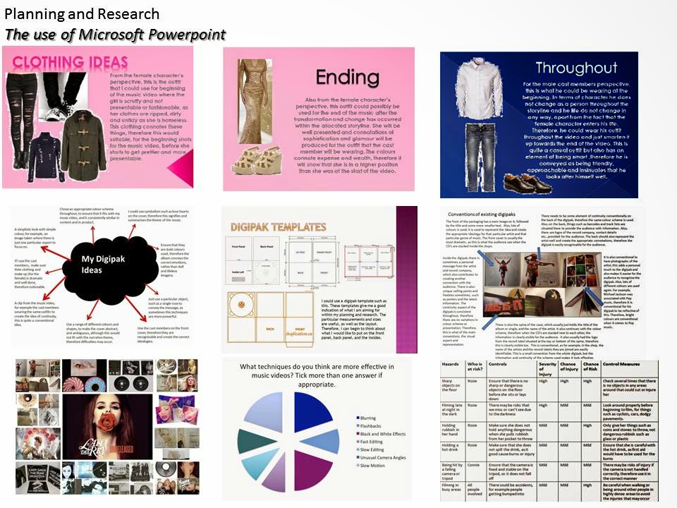
Microsoft Powerpoint was beneficial in terms of
presentations. Therefore, when I had several ideas, such as the clothing and
make-up ideas, then I can collectively adapt them all together within a
powerpoint. I could also adapt the colours, fonts, texts, images and animations
in a personal way which I felt was appropriate. Therefore, this use of
technology was extremely beneficial as I was able to collectively present my
ideas in one way. I also used this element of technology with SlideShare, as I
can merge the presentation into a SlideShare, as this made my presentation both
look neater and more proffessional. Also, I used it with BlogSpot, as I used
the technique of embedding, to allow the presentations to appear on my blog.
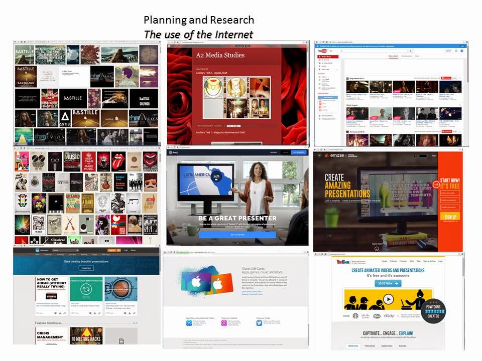
I used the internet for endless aspects of the planning
and research stages. For example, I used Google images to collect appropriate
images of relevant things, which I would need, such as singers, performers, digipaks
and magazine adverts. This allowed me to illustrate my ideas with photographs
and images and was visually pleasing when I uploaded them onto BlogSpot.


I used Wyke Moodle to access the criteria and constantly refer back to it, to ensure that the work I was completing was accurate. I also used this to access things such as templates, for example I got the template for the digipak and the magazine advert, this way I was able to plan and develop my products on the basis of the correct measurements and sizes, therefore it was professional and effective. My teacher also informed me that I can use this to look at students work from previous years, therefore I can form a brief idea and outline of the target and end result in which I am aiming for. I found students who had done successfully, therefore I was able to look at their work, via BlogSpot, and compare the high standard with my work and personally decide on possible improvements and changes.


iTunes was extremely beneficial when it came to purchasing my song. I had previously created an account, therefore I used this aspect of technology to search for Bastille Oblivion, which was my chosen song, and it imminently came up on the screen. This was extremely effective, as it easily allowed to buy the single and download it onto the computer and phone devices. It appeared on the Mac I was working on, therefore it was extremely easy to apply it onto Final Cut Pro, to accompany my moving image.

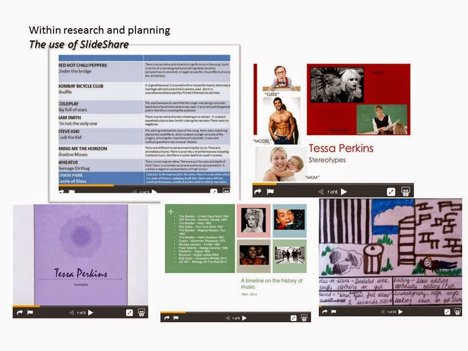
I used SlideShare to put my presentations together,as
the website allowed me to merge all of my slides together. This allowed my blog
and my presentation to look neater and more proffessional, as the layout improvement
and visually it looked better. Also, it was an easy website to use, as it only
took a few moments to upload a file. Also, I also merged the use of BlogSpot
and the use of SlideShare together as I was able to embed the SlideShare’s onto
my blog easily. It was also extremely easy to navigate the SlideShare by
selecting the arrows to move onto the next slide.

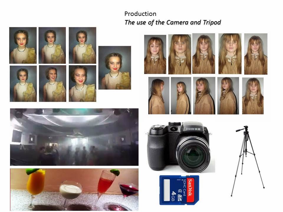
I used my own camera to film, therefore I was aware of
its capability and I was aware of what settings to apply for particular
circumstances to achieve the best result. Also, I used this piece of technology
as I was able to record video footage on it via the SD card and then upload it
onto my blog and onto different devices such as Final Cut Pro and onto the Mac
desktop. I also took my photographs for my digipak and magazine advert using
this particular camera, therefore the process was easy when uploading the
photographs onto the mac and editing them, using technology such a Microsoft Powerpoint presentation and Photoshop.


I also used Prezi, as I had previous experience using this website for AS Media Studies, therefore I thought it would be beneficial to expand my skills and knowledge of the presentational device further. Therefore, I am able to present my work in a different and interesting way. Last year, I was aware of how to carry out simple proceedures such inserting photographs and texts and inseting them into a numerical patten. This year, I developed this further by including links, different layouts and embedding Youtube videos onto Prezi. I also changed the numbered patten, therefore my ideas and analysis were explored in a different order and in a different way. For example, I completed my LIIAR analysis using Prezi, as Prezi is able to contain a lot of information at once. I also used the technique of embedding again, as it allowed me to insert my Prezi onto my blog, this way when the post was published, I was able to play the Prezi automatically and all of the slides would be presented to the viewers by themselves with limited control from me, therefore this technique is effective and proffessional. It also allows the layout of my blog to look neat and well presented.


Facebook was useful for communication, as the Messenger App allowed me to message my cast members easily and directly. It made it easy to arrange things such as travel arrangements, meetings, possible clothing that the cast member needed to bring, confirmation of filming times and I was able to answer any questions that the cast member had. I was also able to discuss what I needed the video footage and images for and how they were going to be used. Also, I was able to print screen these messages and post them on my blog to indicate signs of communication between me and the cast member.

I used Microsoft Publisher when I wanted to produce simple documents, such as when I was thinking of possible places to film. This was effective as I was able to upload images from websites onto the document and annotate them with text boxes. Within Microsoft Publisher, I was able to spread my ideas across the page simply, after I have chosen the particular template that I wanted. I used Publisher to focus on my filming locations and write about why I had chosen these particular choices. Although, the downfall of using this technology is that I cannot embed the document onto my blog. Therefore, I had to printscreen the document and save it as an image, therefore I was able to insert the image as a JPEG. I learnt that using this specific element of technology for BlogSpot is slightly inconvenient, as it is difficult to upload onto my blog.

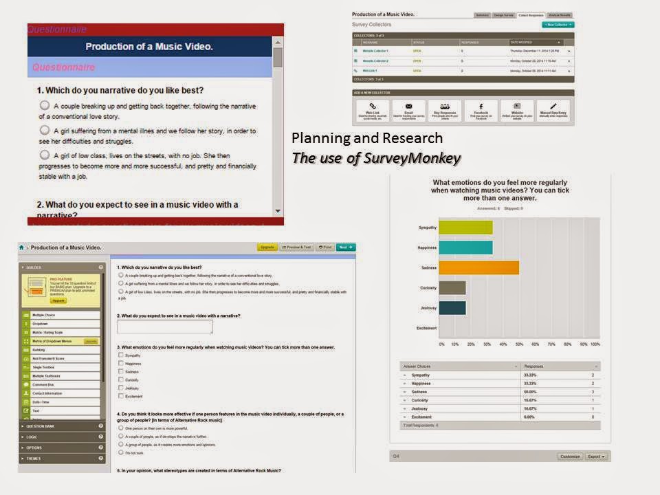
I used Survey
Monkey to produce my own personalised questionnaire. I was able to insert lots
questions in the format that I wanted. For example, I could create multiple
choice questions, questions with drop down box answers, tallies to insert the
answer and just select the one answer the audience thought was appropriate. As
a result of this, I was able to analyse the results that I had received. I
ensured that I got a correct number of answers before I could analyse the
results accurately. I chose the questions
and then typed in the possible answers, I thought about this previously in
order to ensure that I would benefit from the results that I received. On
Survey Monkey, I was also able to edit colours, fonts, layouts and numbering,
this allowed me to make it look neat and presentable. Also, I was
able to insert this onto my blog, therefore people who visit my blog are also
able to complete the questionnaire, as I used the technique of embedding. It
was an effective element of technology as I was got an email informing me when
someone has completed the questionnaire. I was able to access a brief analysis
of all of the results on the Survey Monkey website if I needed. This allowed me
to see the answers that people have ticked or typed in.

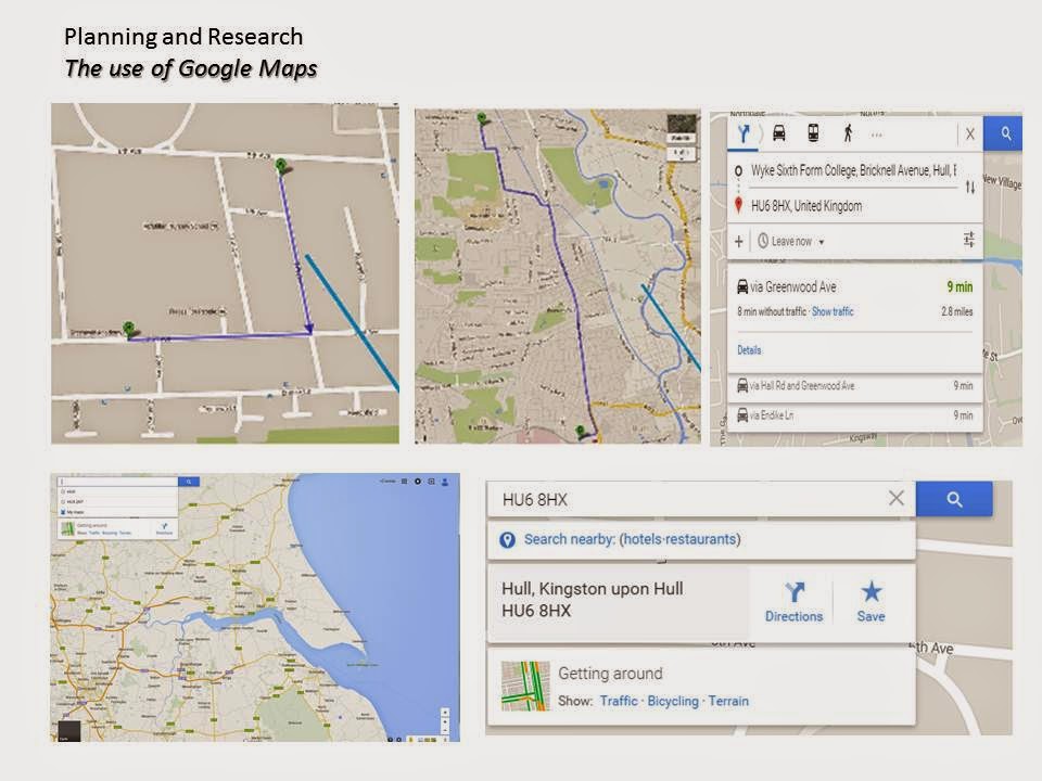
I used Google Maps
to plan the routes that I was going to take in order to reach my locations
successfully. I also selected the different options of travel, such as walking,
public transport or car. I was able to select the different options, I accessed
Google Maps via the internet. For one particular route, I walked as it was
short distance. For the rest of the journeys, I allocated the options of public
transport in order for me to travel long distances easier.It also allowed
me to plan time, therefore I used Google Maps so I was aware of how much time
it would take to reach particular places at certain times. This allowed me to
immediately inform my cast members of the estimated filming time. This element of
technology was beneficial as I was able to plan a schedule. For example,
I knew when I was completing costume changes, completing make up and hair and
shooting particular shots. For example, for the beginning shots I need it to be
a dark environment so I had to arrive at the location at a later time.


I used Google Weather to discover the weather forecast on the particular days that I intended to film. For example, if it was raining on a particular day but I needed a bright sky, then it would have to be re arranged for a different day. Personally, when I researched all of the weather forecasts for my intended and planned days of filming, the weather was of an average temperature with no bad weather on all of the days. Therefore, I thought this was appropriate and fine for filming. I was also able to double check this on the app on my phone closer to the event if I needed. I could also view the particular temperature at certain times of the days. Therefore, when I was planning to film in the afternoon, I was able to access the particular weather forecast at that time. It was easy and effective and as it was Google Maps, I used it would be a reliable device to rely upon. I used this in conjunction with Microsoft PowerPoint Presentation, as I print screened the weather forecasts and inserted them into a PowerPoint, I was then able to add images, text and analysis to the screenshots. I then added the slide the my blog as JPEG’s, this was easy and effective.


I used Microsoft Excel to create table, pie charts, bar charts, graphs and line graphs
to represent the results of my audience research. I was able to change the
colouring and layout, therefore where I put it on my blog, it looked neat and
presentable. It was clear and easy to read and the graphs themselves where easy
to analysis and the results where clear to see. For each question, I used
Microsoft Excel to create an appropriate graph for the particular question. I
was also able to use this in conjunction with BlogSpot, as I print screened the
graphs and the annotations that I had applied. Therefore, it was extremely easy
to upload them all onto my blog and write about them. I used this
element of technology as I had previous experience in using Microsoft Excel,
therefore it was easy and effective for me to create these graphs. It was
also a clear indication of my audience research and it was extremely clear to
see what I had found out and how they results would effect the production of my
music video and two ancillary texts. I also used this in conjunction with
Microsoft Word, as this way I could easily insert the graphs and charts, and
add elements such as titles and analysis of the results, this also made it look
smart and professional.

I used Final Cut Pro in conjunction with YouTube, as when I had finished particular drafts I was able to upload them onto YouTube, and embed them onto my blog. Also, I was able to easily import my footage and add it to the timeline at the bottom. In terms of the development of music video, this was the most beneficial piece of technology, as it allowed me to piece all of the pieces of footage together, and edit and cut them. Also, I was able to edit the speed of particular pieces of footage, as I applied to this to a lot of footages as I slowed the speed down of the footage by 50%. Also, I was able to adjust the lighting and contrast easily and this benefitted my video overall, as lighting between the two halves of the video contrast really strongly. Also, I was able to add edits onto my footage to change the colouring, therefore this improved the visual aspects of my music video as I was able to apply different effects and test each one out. It was also able to add my music easily, as I also used this in conjunction with iTunes, as I was able to easily drag my song onto the Final Cut Pro programme as the song was immediately applied to my video. I was also able to crop images to the appropriate size, therefore I able to zoom in on the part of the video that I wished to focus particularly on. It was also fairly easy to learn how to use, as beforehand I had never made a music video, nor had I ever used Final Cut Pro alone, previously I had used it during group work, therefore I was able to observe other people’s skills. Therefore, it was beneficial for me to learn my own skills and develop my own ideas on how to edit particular pieces of footage and create a moving film.


The use of Photoshop was extremely beneficial, as I was able to edit aspects of my coursework such as my digipak and my magazine advert. It allowed me to enter layers and edit the particular layers individually. This was easy and effective to use as I had experience with Photoshop previously, as this is what I made my music magazine on last year. Therefore, the process of making a digipak and magazine advertisement was quicker and more convenient. I was also able to change the colouring, brightness and contrast of the photographs, for example, within my magazine advertisement I split it into two. My aim was to make half of the page really glum and dark, and the other side bright and colourful, with elements such as the red lipstick emphasised. I also had to do this to the text and logos, this was easily on Photoshop as I could apply colour and edit the contrasts. I could also edit the sizes of the pages, using page layout, this way I was able to change the particular dimensions that I needed for the digipak.
Thursday 26 March 2015

Subscribe to:
Posts (Atom)